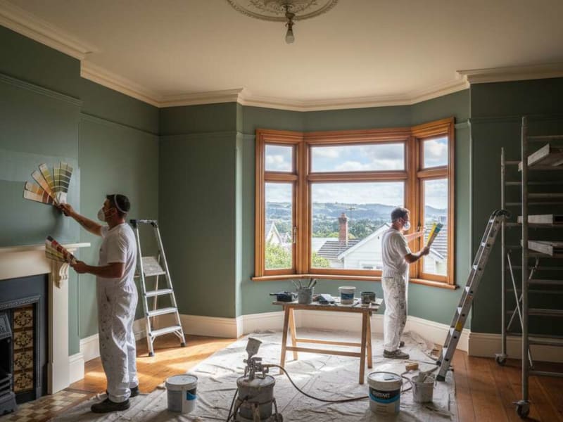
Choosing colours room by room gives you a home that flows while each space keeps its own character. Here is our guide to the best Resene interior colours for every room in your Wellington home.
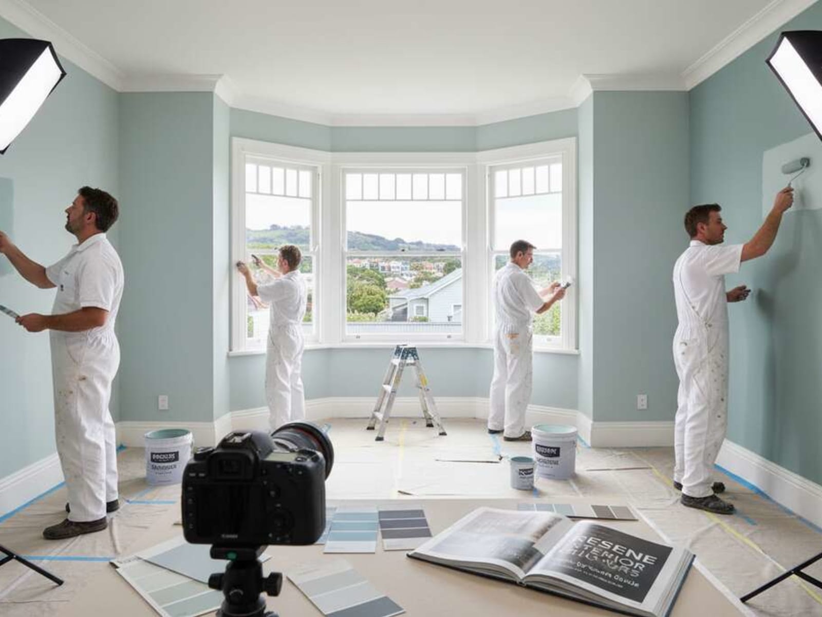
Wellington homes have their own challenges. Overcast winters, south-facing rooms that get little direct sun, older villas with high ceilings and leadlight windows, and newer builds with big north-facing glazing. The colours that work well in Christchurch or Auckland don't always translate here. We wrote this guide with Wellington's light in mind.
Living Rooms
A living room has to do a lot. It's an active social space during the day and a relaxed family zone at night. The colour has to hold up in morning light, afternoon sun (if you get it), and under lamps after dark.
Best Colours
Resene Half Spanish White
- Warm neutral that works with any furniture style
- Doesn't compete with art, textiles, or a busy room
- Bright enough for south-facing Wellington rooms that lack direct sun
- Makes a room feel open and airy without feeling cold
Resene Quarter Haystack
- Gentle warmth without an obvious yellow cast
- More personality than white without taking over the room
- Works well with the timber floors you find in Wellington villas
- Warm in winter without feeling dark or heavy
Resene Sea Fog (feature wall)
- Adds colour without committing to a full repaint
- Nods to Wellington's coast in a quiet way
- Works as a single accent wall behind a TV or fireplace
- Sits well next to Half Spanish White or Quarter Haystack as the base
Finish Recommendation
Resene SpaceCote Low Sheen. Washable, durable, and the right sheen for living areas. Not so flat that marks won't wipe off, not so shiny that it looks like an office. It's the right product for the job.
Avoid in Living Rooms
- Very dark colours on all four walls. They make the room feel smaller and press down from above.
- Strong yellows and oranges. They date fast and are hard to match furniture to.
- High-contrast feature walls in rooms you sit in for hours. You'll tire of them quickly.
Bedrooms
Bedrooms suit quiet, settled tones that help you wind down. Cooler, softer colours tend to support sleep better than bright or hot ones. Wellington's dark winters make this matter more, since plenty of bedrooms barely see direct sun.
Master Bedrooms
Resene Eighth Bison Hide
- Barely-there warm beige that gives a quiet, settled feel without obvious colour
- A warmer step up from plain white, especially at night
- Works in any light, including low-light Wellington winters
- Won't look dated in 5 years
Resene Quarter Stonehenge
- Warm greige with an earthy quality
- Grounding and calm, genuinely restful in a bedroom
- Sits naturally with linen, timber, and natural materials
- Current without chasing a trend
Resene Sea Fog
- Restful blue-grey that helps a room feel calm
- Gender-neutral and flattering in bedroom light
- Gives a calm, ordered feel that's harder to get with warm tones
- Good in north-facing bedrooms, where the blue note balances warm sun
Children's Bedrooms
Soft versions of bold colours:
- Resene Half Sea Fog (instead of full strength. Keeps the colour without the intensity)
- Resene Eighth Akaroa (soft sage green, calming)
- Resene Quarter Rice Cake (warm, gentle neutral)
Pro tip: Use full-strength colour on one feature wall and softer tones on the other three. That gives a child's room personality without overwhelming it, and makes repainting easier when their tastes change.
Guest Bedrooms
Resene Rice Cake or Half Spanish White
- Broadly liked, so guests are comfortable whatever their own style
- Reads fresh and welcoming without being plain
- Easy to keep looking clean between rare use
Finish Recommendation
Resene SpaceCote Flat. The soft, non-reflective finish suits a quiet bedroom. Low Sheen is fine if children are in the room and you want washability.
Kitchens
Kitchens need a light, clean look, real durability against cooking splatter, and colours that hold up under both daylight and artificial light at the same time.
Wall Colours
Resene Alabaster
- Clean white that isn't stark or cold
- Reflects light well, which helps in kitchens that often lack windows
- Classic and unlikely to date
- Pairs with any cabinet colour, from timber to deep green to charcoal
Resene Half Spanish White
- Warmer than pure white, which softens harsh under-cabinet lighting
- Works with most benchtops, including stone, timber, and laminate
Resene Sea Fog
- Catching on as an alternative to all-white kitchens
- Works well with white cabinetry and brass or chrome hardware
- Interesting to look at and easy to live with day to day

Cabinet Colours (if painting)
Painting cabinets is getting more common in Wellington renovations as a cheaper option than a full kitchen replacement. The trick is the right product. Standard wall paint on cabinets will chip and peel within months.
Lower cabinets (can take darker, bolder choices):
- Resene Ironsand. Dramatic, and hides marks and finger smudges well.
- Resene Quarter Stonehenge. Warm and versatile.
- Resene Rivergum. A teal that works well with timber benchtops.
Upper cabinets (keep lighter so the kitchen doesn't feel top-heavy):
- Resene Alabaster or Half Alabaster. The safe, dependable choice.
- Two-tone kitchens are popular for a reason. They add depth.
Finish Recommendation
Walls: Resene Kitchen & Bathroom. Moisture and mould resistant, which matters in Wellington's damp winters.
Cabinets: Resene Lustacryl semi-gloss. Wipeable, durable, and gives a proper factory-finish look when applied right.
Bathrooms
Bathrooms need moisture-resistant products above all else. Wellington homes, particularly older villas with limited ventilation, are prone to mould. Standard interior paint in a bathroom is a false economy.
Small Bathrooms
Stick to light colours:
- Resene Half Spanish White
- Resene Alabaster
- Resene Quarter Sea Fog (if the light is good)
Small spaces need light bouncing around to feel right. Dark colours in a 3m² bathroom feel closed in, no matter how well they photograph in design magazines.
Large Bathrooms
More space means you can add character:
- Resene Sea Fog. Spa-like and calming, and it really lifts a large bathroom.
- Resene Quarter Stonehenge. Earthy and warm, feels a touch luxe.
- Resene Ironsand. On one wall as a dark accent behind a freestanding bath.
Powder Rooms
This is the place to go strong:
- Resene Aubergine. Moody and dramatic.
- Resene New Denim Blue. Rich and popular with interior designers.
- Resene Rivergum. A teal that visitors will comment on.
Powder rooms get used briefly by guests, so they're the right spot for a strong colour that would be too much in a room you sit in for hours.
Finish Recommendation
Resene Kitchen & Bathroom Low Sheen. Mould and moisture resistant, made for humid rooms. It's the only product we'd use on a Wellington bathroom wall.
Home Offices
A home office wants calm, focused colours that aren't stark. With so many Wellington people working from home, this room has become a priority for a lot of homeowners.
Best Colours
Resene Quarter Stonehenge
- Calm and grounding without being bland
- Doesn't distract during long work sessions
- The warmth helps you stay focused better than cool tones do
Resene Sea Fog
- Cool blue-grey that helps concentration, the way offices have long used blue
- Not too cold, not too warm. A balanced choice.
- Looks tidy on video calls without reading as a corporate office
Resene Eighth Bison Hide
- Warm neutral that cuts screen glare and eye strain over long days
- Makes for a settled, focused room
- Comfortable for the long hours a home office tends to demand
Feature Wall Behind Desk
Resene Ironsand or New Denim Blue
- Gives a strong visual anchor and marks out the workspace
- A tidy video-call background
- Adds plenty of personality without changing the whole room
Finish Recommendation
Resene SpaceCote Low Sheen. The mid-level sheen cuts screen glare while staying washable for fingerprints and marks near the desk.
Hallways and Stairwells
High-traffic areas need durable finishes and colours that age well. They take more knocks than any other surface in the house.
Best Colours
Resene Half Spanish White
- Brightens the dark corridors and entry halls common in Wellington
- Shows dirt less than pure white, which matters in a busy space
- Ties spaces together as you move through the home
Resene Quarter Haystack
- Warm and welcoming the moment you walk in
- Doesn't show scuffs and marks as readily as cool whites
- Creates natural flow between living areas
Stairwells
Keep stairwells light. Dark stairwells in Wellington villas feel closed in and become a real safety issue. People misjudge steps in poor light. Stick to Resene whites and pale neutrals in any stairwell short on natural light.
Finish Recommendation
Resene SpaceCote Low Sheen. Washable for scuffs and marks. In hallways especially, flat paint will look grey and marked within months of normal family use.
Open-Plan Living Areas
Open-plan spaces want colour that flows but still hints at the different zones within it.
Approach
One colour throughout. The simplest option, and it feels the most spacious:
- Resene Half Spanish White
- Resene Quarter Haystack
- Resene Eighth Bison Hide

Subtle variation to mark out zones without walls:
- Main living area: Resene Quarter Haystack (warm, enveloping)
- Kitchen area: Resene Half Spanish White (brighter and more practical)
- Dining nook: Resene Quarter Stonehenge (slightly warmer, marks out the eating zone)
Feature Walls in Open Plan
A single accent wall, used with care:
- Resene Sea Fog behind a TV or media wall
- Resene Ironsand behind a dining table (makes an intimate zone in open plan)
- Resene Rivergum in a reading nook or window seat
Finish Recommendation
Resene SpaceCote Low Sheen throughout. A consistent sheen ties the space together even when you vary the colour slightly across zones.
Ceilings Throughout the Home
Traditional Approach
Resene Alabaster or Half Spanish White (one shade lighter than the walls)
- Bounces light back into the room
- Adds a sense of height
- The standard approach works for a reason
Modern Approach (Getting More Common)
Same colour as the walls, the "colour dip" look
- Gives a cocooning, enveloping feel
- Can make a room feel larger by removing the line where wall meets ceiling
- Works well in bedrooms
Dark Ceilings
A Resene Ironsand ceiling in the right room
- High-ceilinged Wellington villas (4m+ stud). Brings the ceiling down to a human scale.
- Adds drama in dining rooms or studies
- Needs confidence and good lighting. It won't suit a low-stud room.
Finish Recommendation
Resene SpaceCote Flat. The non-reflective finish hides ceiling flaws that no other surface shows up. Ceilings always reveal more than walls under certain light.
Trim and Doors
Most Popular
Resene Alabaster
- Clean white with just enough warmth to avoid looking stark
- Pairs with any wall colour in this guide
- Gives a crisp, clean line between wall and architrave
Alternative
Resene Half Spanish White
- Softer contrast than Alabaster. Good when walls and trim share a similar warm tone.
- Works in older homes where bright white trim looks out of place
Finish Recommendation
Resene Lustacryl Semi-Gloss. Durable, wipeable, and gives the traditional trim finish that looks right and professional.
Whole-Home Colour Strategies
Single Colour Throughout
Benefits:
- Maximum cohesion. Everything flows.
- Spaces connect visually, which makes smaller homes feel larger
- Easier to furnish. No need to match room-to-room transitions.
Best choices: Half Spanish White, Quarter Haystack, Eighth Bison Hide
Room-Specific Colours
Benefits:
- Each room gets its own character and a feel that suits its use
- You can set each room up for its light direction and function
- More interesting to live with over time
Challenge: It needs careful coordination, especially at doorways where two colours meet. Get it wrong and the transitions jar.
Hybrid Approach (Our Recommendation)
- Main living areas and hallways: One consistent colour (Half Spanish White) for flow
- Bedrooms: Individual colours to suit each person and orientation (Sea Fog, Stonehenge, Bison Hide)
- Bathrooms: Practical whites with moisture-resistant products (Alabaster)
- Feature walls: A bit of personality in chosen spots (Ironsand, Rivergum, New Denim Blue)
This gives you a home that feels of a piece from the front door but shows more personality as you move through it. It's also the most practical to budget. The living areas are one colour throughout, which keeps the product list and touch-up costs down.
Frequently Asked Questions
How do I choose between Resene Sea Fog and Resene Half Spanish White for a living room?
Start with your natural light. South or west-facing rooms that get little direct sun do better with the warmth of Half Spanish White. North-facing rooms with plenty of light can take the cooler blue of Sea Fog without feeling cold. Sea Fog also works better with timber flooring, where the warm floor balances the cool wall.
Can I use the same colour in an open-plan kitchen, living, and dining area?
Yes, and it's usually the most cohesive option. A single neutral like Half Spanish White or Quarter Haystack across an open-plan space reads larger and more unified than splitting it into zones with different colours. Mark out the zones in other ways instead: furniture layout, rugs, lighting.
My house has high ceilings. Do I need a different approach?
Wellington villas with high studs (3.5m+) can take deeper wall tones without feeling closed in. The height gives the room breathing space that low-stud rooms don't have. You can also use the ceiling colour to bring a very high room into a more comfortable scale. A darker ceiling tone can make it feel cosy rather than cavernous.
How do I make a small Wellington apartment feel larger with paint?
Three reliable tricks. Paint the ceiling the same colour as the walls so there's no visible horizon line. Use the lightest version of your chosen colour (Eighth or Quarter strength). Carry that one colour through all the spaces without breaks. Skip feature walls in small spaces, since they draw the eye to a boundary rather than past it.
Related Services:
- Interior House Painting. Interior painting, room by room.
- Colour Consultation. Guidance for whole-home colour.
- Resene Eco Decorator. Certified Resene application.
Need help choosing room colours? We offer a free colour consultation based on your home's light, layout, and how you live. Get in touch.
Professional Colour Consultation in Your Area
Need help choosing the right colours? We offer free colour consultations across Wellington: Paint Colour Visualiser · Paint Cost Calculator · Exterior Painting · Interior Painting. Get a free quote today.
Related Articles

Need Help With Your Painting Project?
Wellington Decorators has been transforming homes across the Wellington region since 2023, led by a founder with 18+ years in the trade. As Registered Master Painters, we back every job with a 5-year workmanship guarantee.
Prefer to talk? Call us now 027 458 6465