
Paint two coats of the sample on a large piece of white card, leave an unpainted border, let it dry fully, then move it around every wall of the room and look at it morning, afternoon and night. Do not dab the sample straight onto your existing wall, because the old colour around and under it changes how you read the new one.
That is most of the method. The rest is avoiding the handful of small mistakes that make a perfectly good sample lie to you.
Why not just paint a patch on the wall?
Because the wall is already a colour. Resene's MasterStroke guide on testpots says directly not to paint onto your wall, as the existing colour will affect the appearance of the new colour. A soft white patch surrounded by a yellowed cream looks brighter and cooler than it will once the whole wall is that white. A grey patch on a warm beige wall picks up contrast it will not have on its own.
There is a practical cost too. A thick, rolled-on sample patch can leave a raised outline or a sheen difference that shows through the finished coats. You can prepare for that, but a card avoids the problem entirely.
How big should the swatch be?
Bigger than feels necessary. The MasterStroke guide suggests A3 white card with two coats and an unpainted border around the edge. Resene's own colour-testing article makes the reason plain: small swatches compress information, and a deep charcoal that looks rich and balanced in a small rectangle can look far darker and more dominating across a whole wall. It also says an A4 drawdown should be the bare minimum for professionals judging a colour.
In practice, make two cards if you can, so you can hold one against the other at the corner of a room and see how the colour looks reflecting off itself, which is exactly what it will do once all four walls are done.
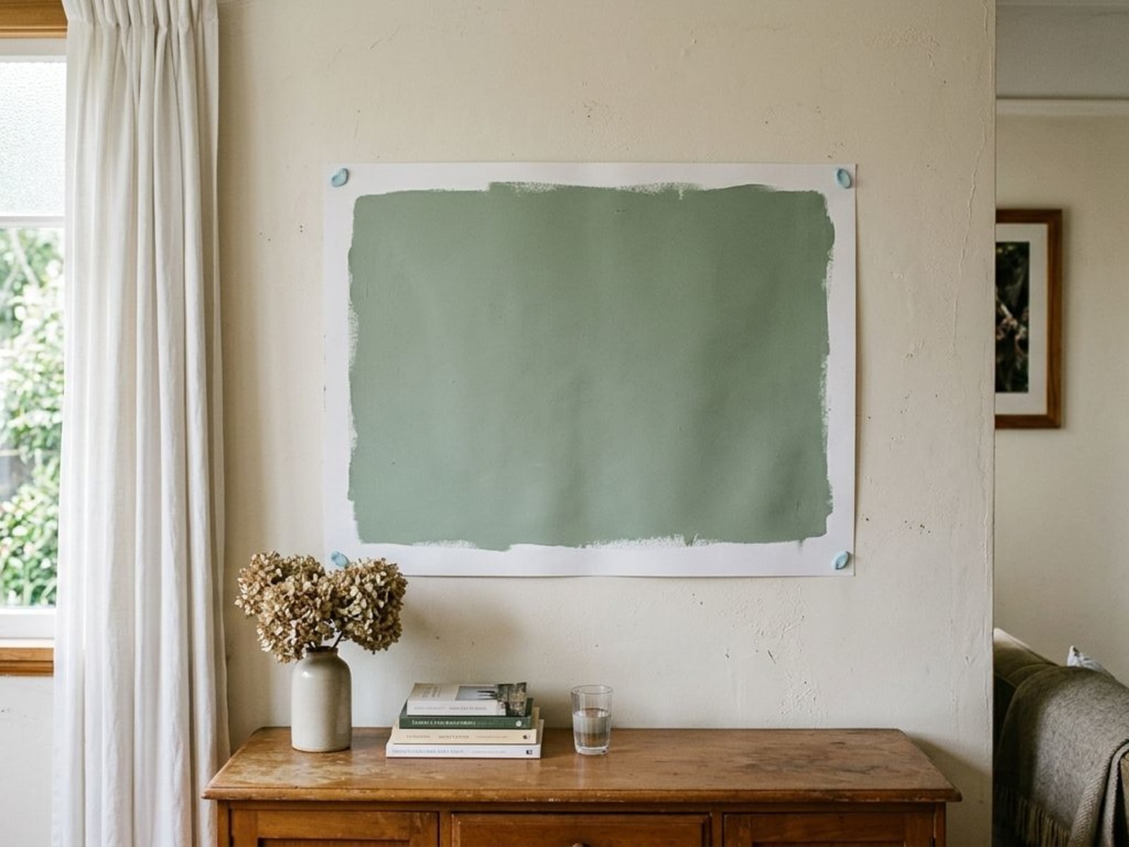
How do you make the card properly?
- Use stiff white card, not a scrap of printer paper that curls.
- Stir the testpot well. Pigment settles in small pots.
- Brush on two full coats, letting the first dry before the second. One coat is thinner and often lighter than the finished wall.
- Leave a white border around the edge. It gives your eye a fixed reference so the colour cannot drift.
- Let it dry completely before judging it. Resene's colour-testing article notes that wet paint usually appears lighter than it does once dry.
- Write the colour name on the back, not the front.
Where should you put it?
On every wall of the room, one at a time. MasterStroke says to attach the card flat to the wall with Blu-Tack and to move the swatch onto other walls or rooms and look again. Resene's colour-testing article adds that you should view it exactly where it will be used, from different positions and orientations.
The wall with the window in it is the one that fools people. It sits against the light, so everything on it reads darker. The wall opposite the window gets the most direct light and reads lightest. The same colour can look like two different paints across one room, and you want to know which of those two you can live with before buying the full tins.
Put the card low as well as at eye height. Colours read differently near the floor, in the shadow of furniture, than up where the light lands.
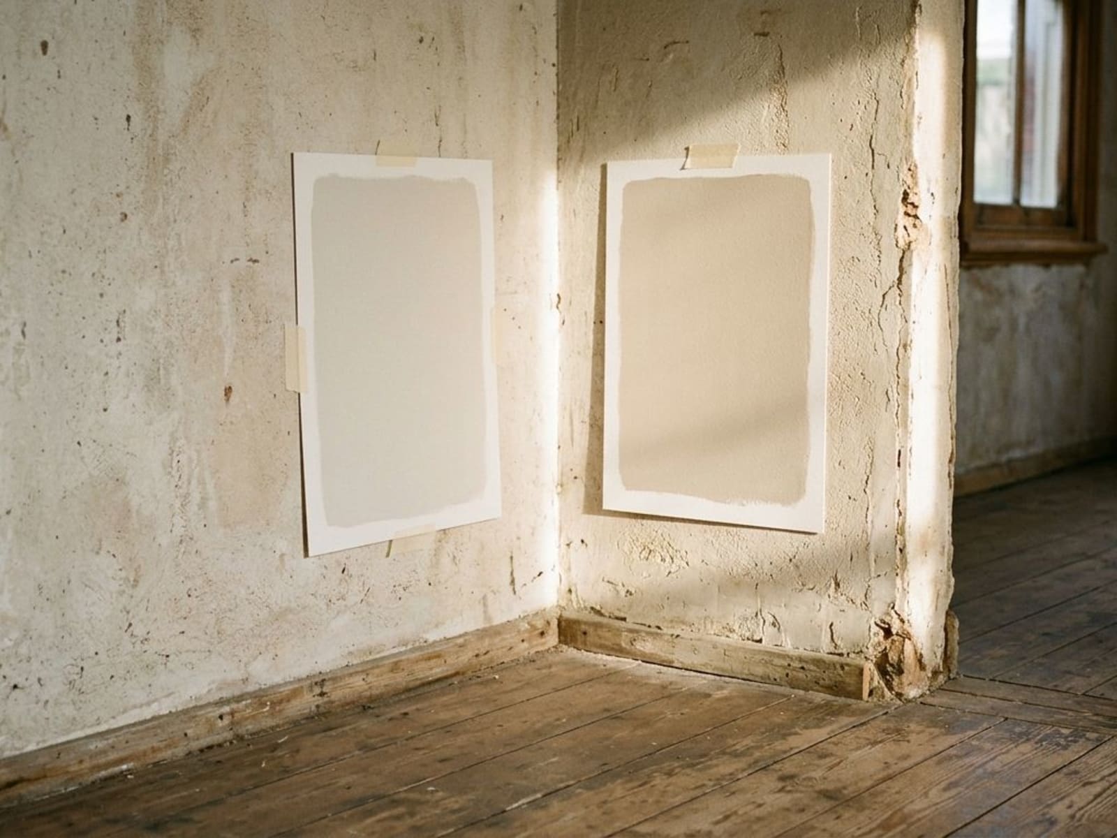
What time of day should you look at it?
All of them. MasterStroke recommends observing the swatch at different times of day and night, in daylight and under artificial light. Resene's colour-testing article notes that colour shows best in broad daylight and becomes harder to tell apart as evening falls.
A few things worth checking at each viewing:
- Daylight, sunny and overcast. Resene's colour-perception memo notes that colours look different in direct sunlight than under an overcast sky. Look on a bright day and a grey one.
- As the light moves. Check the card in the morning and again in the afternoon, and note any shift. Compare it against the chip each time.
- Evening with lights on. The same memo says differences become even greater under artificial light. Check under your actual bulbs, not the shop's.
Resene's article also points out that daylight in New Zealand and Australia is crisp, bright and often more intense and bluer than in many northern hemisphere locations. That matters when you are copying a colour from an overseas magazine or feed: it was photographed in different light.
What else can make the sample misleading?
| Mistake | What happens | Do this instead |
|---|---|---|
| Painting on the existing wall | Old colour skews the read; possible visible patch later | Paint a card |
| One thin coat | Lighter and patchier than the finished job | Two full coats |
| Judging it wet | Reads lighter than it will dry | Wait until fully dry |
| Small swatch | Deep colours look milder than on a whole wall | A3 card, or two |
| One wall, one time of day | You see one version of the colour | Every wall, morning to night |
| Different sheen from the final paint | Glossier finish reads richer | Match the sheen where possible |
On that last row, Resene's technical memo on colour perception notes that the same colour in gloss appears richer, brighter and more intense than in flat. If your walls will be low sheen and the sample is a different finish, allow for that when you judge it. Our guide to paint sheen levels explains the differences.
One more: if a deep colour will be going over a tinted undercoat on the actual job, ask the painter or the shop whether that affects the final shade, and if in doubt put the same undercoat on your card first.
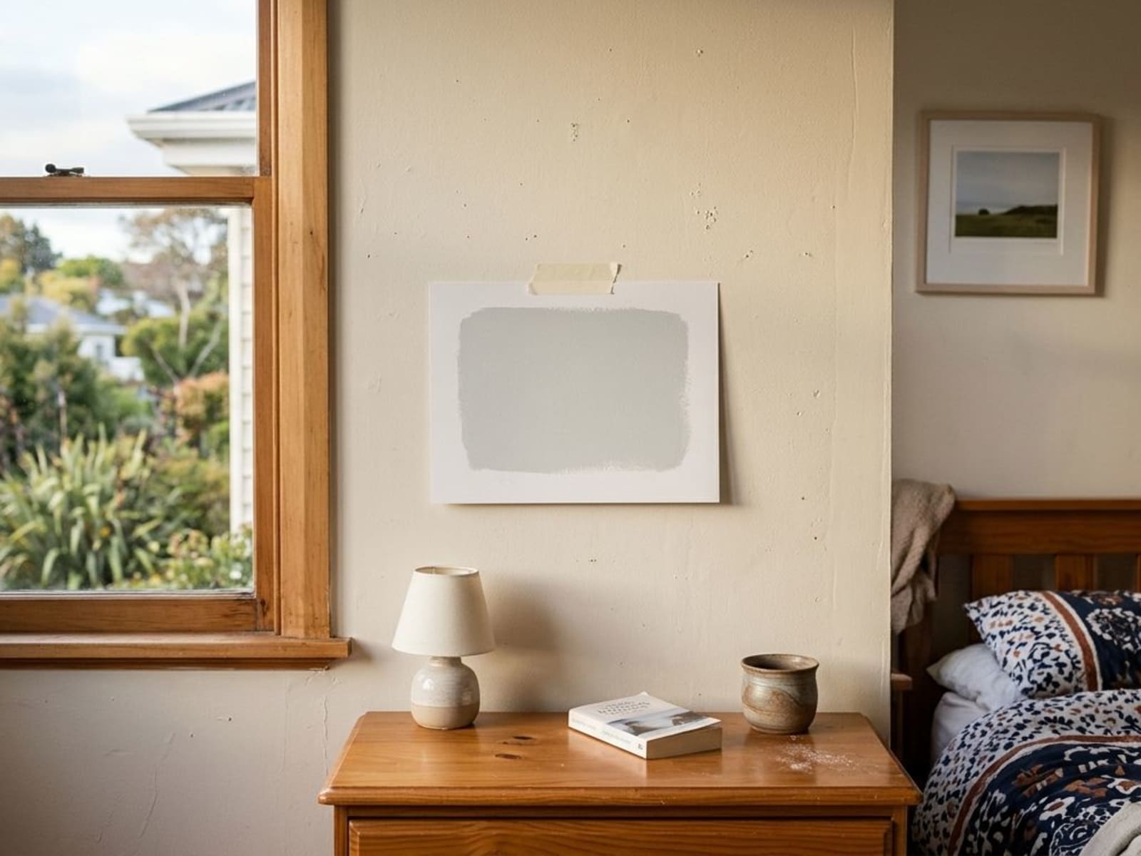
How many colours should you test?
Two or three finalists. Shortlist on the chart, then test only the ones you would genuinely be happy with. Our overview of Resene colour charts is a reasonable place to narrow the field before you buy testpots. Testing ten colours at once turns every card into a comparison with the one beside it, and you end up choosing relative to the other samples rather than to the room.
If you are close to a decision and want a second opinion on how a colour will behave in your house, we are happy to look at your cards when we come to quote. Book a quote and bring them out.
Related Articles


Need Help With Your Painting Project?
Wellington Decorators has been transforming homes across the Wellington region since 2023, led by a founder with 18+ years in the trade. As Registered Master Painters, we back every job with a 5-year workmanship guarantee.
Prefer to talk? Call us now 027 458 6465